Monday, 22 October 2012

Adventures in India...

Apologies for the hiatus in posting, I have recently graduated from UCL, moved, and started my new job as a researcher on a fascinating project.

Before all the fun and games of life as a working gal began however, I took a once in a life time trip to India with one of my oldest and closest friends, Amaryllis. We travelled for three weeks all across Northern India, from the Thar desert through Rajasthan to Calcutta in the East. It was the most entrancing holiday I had ever been on. Despite the fact that between the two of us we had done a fair bit of traveling, neither of us had been anywhere like India. It was incredible in both the good and the bad. The sites were saw on a daily basis in terms of architecture and history were often shockingly beautiful. Yet we were also confronted with a world very different from the one we had left back in England, both in terms of poverty but also cultural values. It certainly opened our eyes to an exotic world that definitely could not be unwrapped in a mere three weeks. We really only scratched the surface. I thought I would share some photographs that we took on the trip (as you can imagine there were quite a few!)
The Thar desert
Image courtesy of Aimee Holmes
Camel trekking, Amaryllis on the left and I am in the centre.

May I introduce you to our camels: Alfred and Carol. Our names for them, as you can imagine.
The Mehrangarh Fort, Jodphur. Built in 1459, it is absolutely stunning. This was one of the female only Royal courtyards.
We met some awesome Indian kids. At first they could be shy but after a while they would crack the most insane smiles and were keen to laugh and play with you. These are the children of a local potter who we visited. 
Jain Temple
The interior of the Jain Temple. Like something out of Tomb Raider! It was monsooning outside so you could hear all the reverberations on the roof and rain was pouring down the walls onto the marble floor. 
A lot of the Indians we saw liked to take photos and videos of us on their mobiles. So we started doing it to them! It was an annoyance but actually by joining in it often broke the ice.

These two images are from Pushkar, a very holy city. It rained so hard here we were stranded in the hotel for an evening. This was the night we were introduced to the joy of Bollywood films!
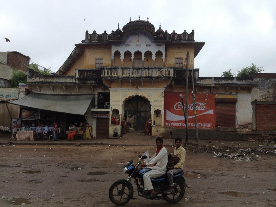
Image courtesy of Amaryllis Earle.
So this is the shot you get up at 5am for! Amaryllis and I at the Taj Mahal. Funnily enough the Taj Mahal has never been something I was ever really over keen to see, but once I saw it that early in the morning, I was totally blown away. As it was monsoon season the sky was so pale it looked like the marble was almost disappearing, or appearing Im not sure...
View of the Ganges, Varanasi. 

One of the places that first drew me to India was Calcutta. I spent a lot of the last year at university studying British Colonial and Post-Colonial presence in India, so Calcutta was obviously a hot topic for us. For me, Calcutta was one the highlights of the trip. We were lucky enough to go to the South Park Street Cemetery, which was full of Western inspired tomb sculptures. It was so far removed from the urbanised hussle and bussle of the city outside the cemetery walls, with wide boulevards surrounded on either side by giant mausoleums under the dense cover of mango trees. It was such an unusual place, again like the setting for an adventure film.
Unusual mix of European monument style and Jain (see temple images above). There were so many different examples in this amazing place. Such a hidden gem, I would definitely recommend it to anyone who happens to visit Calcutta.
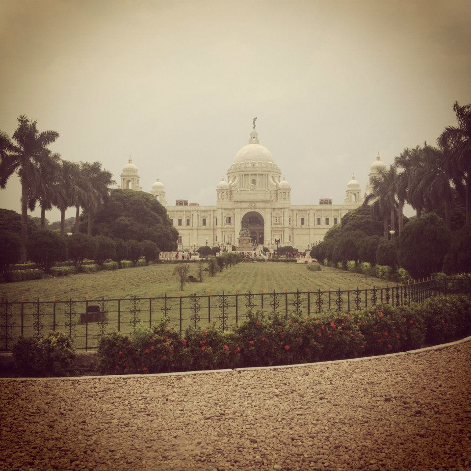
  Victoria Memorial, Calcutta. So beautiful, but also such a beacon for British presence in India. I was surprised that it is essentially a massive empty space, literally just designed for grand ceremonial occasions that only a hand full of people would get to attend. It reminded me that British rule in India was so much more about the show of power rather than actual authority and governance on the ground. 

Amaryllis also has her own (rather more professional and exciting) blog which promotes positive beauty both inside and out! She has some fabulous posts from interior decorations to do it yourself hairstyles so I thoroughly recommend you check it out! The site is called www.deeperdazzle.com
The post on India Unplugged by Intrepid Travel, which is what our trip was called, is linked here:
http://deeperdazzle.com/2012/09/

Sunday, 8 July 2012

A few snaps from a recent visit to the Natural History Museum

Currently I am interning at Christie's and so get to spend my lunch breaks having a quick mooch around the V&A and the Natural History Museum. There are worse places in which to eat your packed lunch! These two photos are just two from a selection that I took on my phone, particularly love the two kids getting their photo taken by the saber tooth cat!
Whale skeleton paws
Saber-tooth cat


Sunday, 1 July 2012

Art for the Masses-The Public Catalogue Foundation


With the advent and rapid development of the internet, information has suddenly become available at the click of a button, or a touch of a screen. We can access information at home, work or on the move. We can comment, criticise and ‘like’ ideas and images that circulate at a rapid pace. The unprecedented control that the public body has gained over its own direction and presentation has proved somewhat of a problem for major institutions, who traditionally held the reins of power in regards to how ideas and particularly images were disseminated into the public domain. Copyright laws, so tightly entangled in ideas of ownership and restrictions, now seem incongruent with the modern world in which everything you would ever need to know is obtainable via the internet.

Exciting steps are being made however, with institutions moving towards making their catalogues more accessible to the public. This is in keeping with the general move away from the institution as an elitist organisation. The museum and art gallery are now required to make themselves portals of information open to all. They must provide a public service that is accountable to the taxpayers needs. The Public Catalogue Foundation, working alongside the BBC and its ‘Your Paintings’ initiative hopes to create a comprehensive online catalogue of the 200,000 paintings that are in what are considered to be ‘public institutions’. These refer to museums, government offices, public libraries and council buildings. Due to a lack of space, as many as four out of five paintings in public institutions are not on display to the public, and many will have never been photographed before this ambitious project. Since the site launched earlier this year, it has already uploaded an impressive 145,000 oil paintings, and so is over half way to its target. It aims to have another 21,000 uploaded in the next few months.

 ‘Your Paintings’ is a classic example of how the twenty first century can engage the public with its artistic heritage. By using media that most people today are more than familiar with, it seeks to make art and history relate to the public, and even make it ‘trendy’. On the site you can ‘tag’ paintings, where you are asked to indicate things, names, places, events and subjects that spring to mind when you look at each particular image. In this way the site is asking for the public’s help in organising this colossal archive into some kind of scheme, as with each tag the paintings are classified. Encouraging the viewer to look at these paintings more closely, it also makes the catalogue inherently interactive, more of a dialogue between the public and the institution. You can also tweet about the site, post it on Facebook, send paintings to your friends. You can even develop your own ‘My Paintings’ page where you can add and delete paintings to your own private collection.

The Public Foundation Catalogue has inspired a myriad of other organisations to attempt the publicisation of entire catalogues online. The Getty Research Portal is just one of many, as well as the Poissin Conoisseurship Project run by Dr. David Packwood. In the future, it is not inconceivable that all art works in all countries could be assessed via various forms of online media. This would of course include the wider circulation of many lesser-known works, and the increased publicisation of less visited art galleries and museums. This project also marks the advent of institutions working together in a collaborative effort to provide an arts service to the public domain.

At the earliest, the ‘Your Paintings’ site should be finished by late 2012. The completion of this project could mark a juncture where access to image information is no longer restricted to the academic elite. No longer will you need a back stage, VIP pass to gain access to the full extent of the artistic pedigree held in public institutions. Comprehensive and even exhaustive scholarship will now be possible. With this project, the nations’ oil paintings really do become ‘Your Paintings’.

Link to the 'Your Paintings' site http://www.bbc.co.uk/arts/yourpaintings/

Monday, 11 June 2012

Invisible: Art of the Unseen 1952-2012 at the Hayward Gallery, London


Tomorrow the Hayward Gallery are opening an exhibition of 'invisible' art. However dubious I was about this in concept and execution before I went, I would say that it is definitely worth a visit. 

Yes, that right, these are framed white pieces of paper. The one of the right that you can barely see? That is a rubbed out Playboy centre fold. All three by Tom Fieldman.

Andy Warhol once stood on this plinth, could I still feel his celebrity presence? I would say no, but an interesting concept.


So is this what happens you put on an invisible exhibition, you get invisible visitors?!!!! To be fair we were at the press view, I just can't see this exhibition pulling in the crowds. Especially when you are essentially paying £10 to look at some blank walls.

'Invisible: Art of the Unseen 1952-2012' runs from 12th June until 5th August 2012. Tickets £10.
http://ticketing.southbankcentre.co.uk/find/festivals-series/invisible-art-of-the-unseen-1952-2012


Wednesday, 23 May 2012

Some Reflections on Lucian Freud: The Hype and the Reality


By Ally Crossland

Nowadays, the British public are bombarded with the Lucian Freud image. His portraits seem to be everywhere, making a big splash in the exhibition world as well as the auction houses. The National Portrait Gallery’s blockbuster Lucian Freud Portraits has certainly drawn in the crowds. In fact it has been the galleries most successful show ever, receiving over 175,000 visitors through its doors. Its popularity has no doubt been helped by a visit from the ever glamorous and on trend Duchess of Cambridge. Freud has long been seen as the saviour of British Art, one of the most revolutionary artists for generations. Some claim the hype of the Lucian Freud brand has outshone the brilliance of his raw and uncompromising talent. Others feel, as one online sources comments, that Freud was an ‘ugly painter, of ugly people’.

Yet, in my humble opinion, no better accomplished and talented artist could have been given the honour of almost the entire lower floor of the National Portrait Gallery, in which to hang perhaps the most important retrospectives of the last few years. Possibly not since the Francis Bacon exhibition at the Tate in 2008 has such an important retrospective focused on the work of one British artist working in the twenty-first century.

Freud's early portrait of his first wife Kitty
From the exquisitely detailed portraits of his youth, with electrically charged eyes and doleful expressions, Freud showed prolific talent. As an artist his penetrative gaze allowed him to access the inner qualities of the sitter. He revealed the secrets about them that they would rather keep hidden, laid bare and uncompromised on the canvas.

In Freud’s later portraits he did away with any pretence of formality, stripping the sitter to the bare bones and flesh that make up what it is to be human. Whether clothed or nude, Freud’s sitters are depicted in the most brutal yet sensitive way. Contorted into uncomfortable positions, their faces un-idealised, mournful and pensive, Freud’s sitters reflect real people and emotions that can be seen and felt in today’s world.
Life model Sue Tilley and 'Benefits Supervisor Sleeping'
Two of Freud's last portraits, with 'Portrait with Hound' 2011 on the right
The bodies in Freud’s portraits become swathes of raw pigment forced onto the canvas. Faces are contorted by age or an inner complexity that will never be fully realised by the spectator. What Freud achieves is a realness that other portraitists would never dare to address. He claims the subject for himself and enters into a relationship with the sitter, part trust and part animal attraction. His later works, even the painting Portrait with Hound, painted up until Freud’s death in 2011, shares this same brutal honestly. Yet it is also beautifully poignant. This unfinished portrait finishes mid-sentence, leaving the spectator to fill in the blanks. In a sense this is quite apart from the rest of the exhibition, which successfully depicts all the different stages of Freud’s life through his paintings. The paintings, which so define Freud’s life, speak for themselves, and in my opinion find a voice within the walls of the National Portrait Gallery. They may be ‘ugly’, but in the same breath they are truly exquisite reflections of the very real people that made up Freud’s world.

Lucian Freud Portraits runs at the National Portrait Gallery until the 27th May 2012.Admission £14. Concessions £13 / £12 With Gift Aid (includes voluntary Gift Aid donation of 10% above standard price): Admission £15.40. Concessions £14.30/£13.20

Saturday, 5 May 2012

Art Crush: William Dobson

Apologies for the lack of posts recently, dissertation lock down has only come to be replaced with finals lock down! Only two weeks to go and then frequent posting shall resume.

Meanwhile, in the course of my revision I have discovered by latest artist obsession in the work of one William Dobson. Dobson was Charles I's principle portraitist who painted the monarch and his followers during the Civil War. For me, his works have a bold brilliancy that is utterly captivating. Dobson used simple compositions, quite different from the often outrageously ostentatious ensembles that were favoured by Van Dyck; who he was greatly inspired by. You can see his self portrait here:


 Dobson was clearly inspired by Van Dyck's self portrait, which belongs to the Philip Mould Gallery. Nice frame huh?!


Below is one of Dobson's portrait of Charles I's most loyal cavaliers, Colonel Richard Neville, painted c.1643. Dobson often adopted simple yet effective symbolism to show the beliefs of the sitter. Here Neville is seen swathed in the bright red cloth that showed him as an out-and-proud Royalist. His helmet and gun are ready to be picked up and taken out to the battle field which is depicted behind him. The dog represents loyalty to the crown.


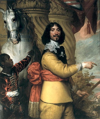
Finally, this is my favourite. Check out Lord Byron's ancestor! Another clear reference to Van Dyck in the column and the horse. Here Byron is showing off the war scar on his face, and pointing down to the battle scene with his baton of office. Instead of actually joining in the battle of course.


Wednesday, 14 March 2012

David Hockney: Nature on Acid?

The Royal Academy’s latest blockbuster showcases a colossal selection of works by David Hockney RA, portraying his career long engagement with the natural landscape. Much of the exhibition is taken up with large-scale works depicting the landscape of Hockney’s childhood in the Yorkshire Wolds. Hockney’s manipulation of space is translated to the canvas through broad swathes of lurid colour giving the works a mesmerising, almost hypnotic effect. His fearless use of bright colours to construct the natural beauty of the British countryside is reminiscent of the Impressionists bold application of unmixed pigments.
'Winter Timber 2009'
 Hockney’s daring use of colour is joyful, full of energy and promise. Many of the works are large-scale rural scenes, and are arrangement of several canvases placed together. The work that has been assaulting our eyes from Tube posters for months, ‘Winter Timber 2009’ has every crevice of canvas filled with vivid colours, a long line of trees drawing us in through the winding path. These floor to ceiling works have an almost Rothko-esque effect. The spectator is sucked into a whirlwind of colour and movement.

'Three Trees near Thixendale Winter 2002


Several scenes are repeated a number of times, each depicting a different season. Here, Hockney’s incredible use of colour comes into its own, using blood orange and berry red for autumn, then soft lavender and palest blue for spring. The collage of paintings that depict different countryside scenes in Yorkshire create an aura of peace and tranquillity, yet the expressive use of colour gives them an energy and alertness that sums up an almost child-like enthusiasm. This celebration of a very British image seems to tap into a distinct nostalgia for a re-engagement with nature itself. Indeed these Yorkshire landscapes are reminiscent of any countryside walk in Britain, and certainly reminded me intensely of my childhood in Wiltshire. This shared experience of the natural world makes it easy for people to relate to Hockney’s work.
One of Hockney's Ipad paintings


Hockney also engages with new mediums that succeed in bringing his depiction of the natural landscape into the 21st century. His much anticipated ipad paintings have created quite a stir. In a time when many artists are rejecting the proliferation of new media as something that downgrades the art of sketching and drawing, Hockney embraces it with open arms. With around fifty of these ipad creations increased in size and printed on paper, it is like stepping into a forest gland in a soft summer light. However, I feel these ‘paintings’ lack the intensity and passion of his oil works, and seem to be really about engaging new audiences with exciting new mediums.


Another medium I feel was much more successful was his use of video art as a highly evocative insight to the peace that can be experienced when contemplating a countryside scene. With eighteen individual video panels displaying a different time frame for the same woodland scene, the distorting movement cleverly recreates the movement of the trees being blown by the wind. In this way, it is much more indicative of the multi point vision that we actually use to see the world around us.   

Hockney has undoubtedly succeeded in reconstructing the nostalgia of the natural world for the 21st century audience. His works do not shy away from making a statement, and his joyful use of colour effectively construct a positive nostalgia for the British countryside. The vibrancy of his works are utterly captivating, and his almost paint-by-numbers technique is a bold and modern approach to the depiction of the traditional landscape.